A Richoco project · EdTech · Study abroad
Univacity
Cutting the average university application from 25 min to 7.
A mobile redesign that brought admissions, visas, flights, hostels and scholarships into one app for African students.
- Univacity
- EdTech · Study abroad
- UX research, UX strategy, Product design, Design system, Design QA
- 5 months, discovery to V3 app release
- 1 product manager and business analyst, 2 engineers (mobile and web), 4 customer support staff
- 42%
- increase in completed applications within 6 weeks of the redesign
- 69%
- reduction in onboarding drop-offs
- 25 → 7 min
- average time to complete an application
- 30%
- increase in partnerships, with partners citing the improved student experience
The brief
One platform for the whole journey, and an app that couldn't hold it
Univacity helps African students find and apply to thousands of institutions worldwide. It also offers the services that come next: hostels, scholarships, visa support, flights and event registration.
The existing app showed promise, but it lacked cohesion, couldn't scale, and gave students few reasons to trust it. As Univacity's plans grew, the mobile experience needed a strategic overhaul and a design foundation that could carry over to the web.
We led UX strategy and product design for the redesign:
- The experience strategy for students and recruiters.
- Discovery, user research and usability testing.
- User flows, wireframes and high-fidelity prototypes.
- Close work with engineering and business stakeholders.
- Oversight of the build, so the shipped app matched the design.
The problem
Students were piecing the journey together through intermediaries
Getting to a university abroad was disjointed and stressful, and the old app did little to help.
- Universities, housing, visas and funding were scattered. Students often relied on intermediaries they couldn't trust.
- The app had no personalisation, no progress tracking and no clear service flows.
- Nothing in it built trust.
- Its architecture couldn't take on new services.
- Recruiters struggled with applicant tracking, document checks and engagement.
Goals
The redesign had to fit the whole journey in one app
- Bring discovery, application, services and onboarding into one platform.
- Work mobile-first, built on trust, clarity and simplicity.
- Turn scholarships, flights, hostels, visa and events into modules with clear ways in and out.
- Give recruiters better filters, candidate tracking and document tools.
- Lay a foundation the web platform could build on.
Research
For many students, the phone was the main device, sometimes the only one
We interviewed 18 students in Nigeria, Ghana and Kenya, 5 recruiters and 3 visa and travel agents, and mapped where the existing journey lost people.
- Students wanted clarity and a human to help them.
- Trust was a major blocker.
- Recruiters wanted less noise, more structure and smarter workflows.
- Mobile was the main device for many students, and sometimes the only one.
Key decisions
Three decisions carried the redesign
- 01
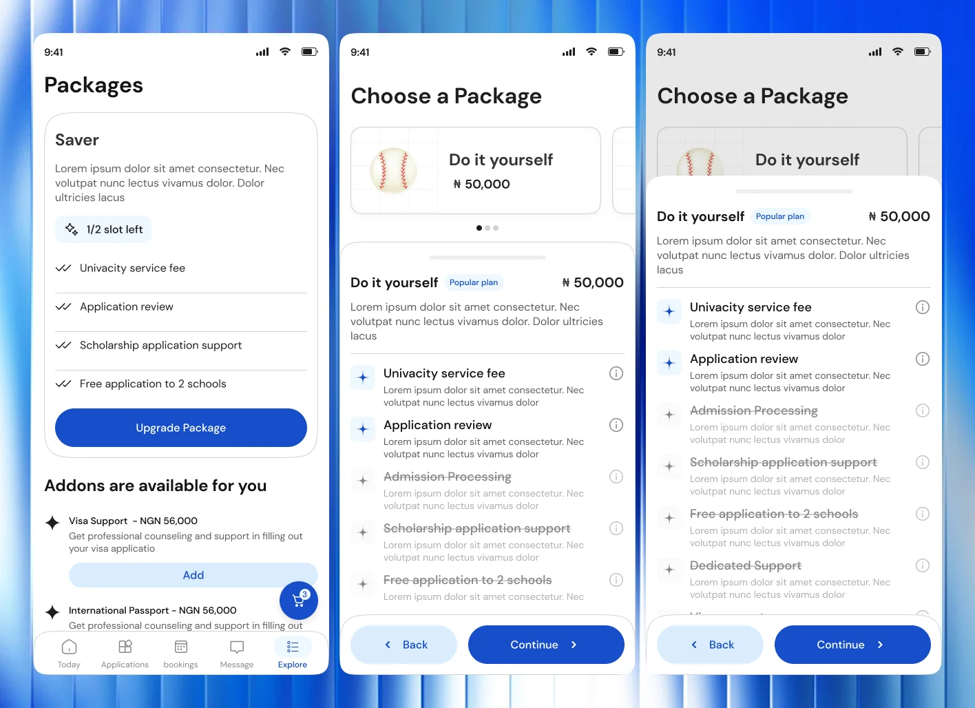
Packages for trust and support
Trust was a major blocker. Students wanted clarity and a human to help, and often turned to intermediaries they couldn't rely on.
Service packages, so every application gets expert support from the start. The level of support depends on the package, and every student gets basic guidance. Defining the packages took several rounds of revisions and strategy calls.
- 02
Personalised onboarding
The old app had no personalisation or progress tracking, and most apps lose their users within the first week.
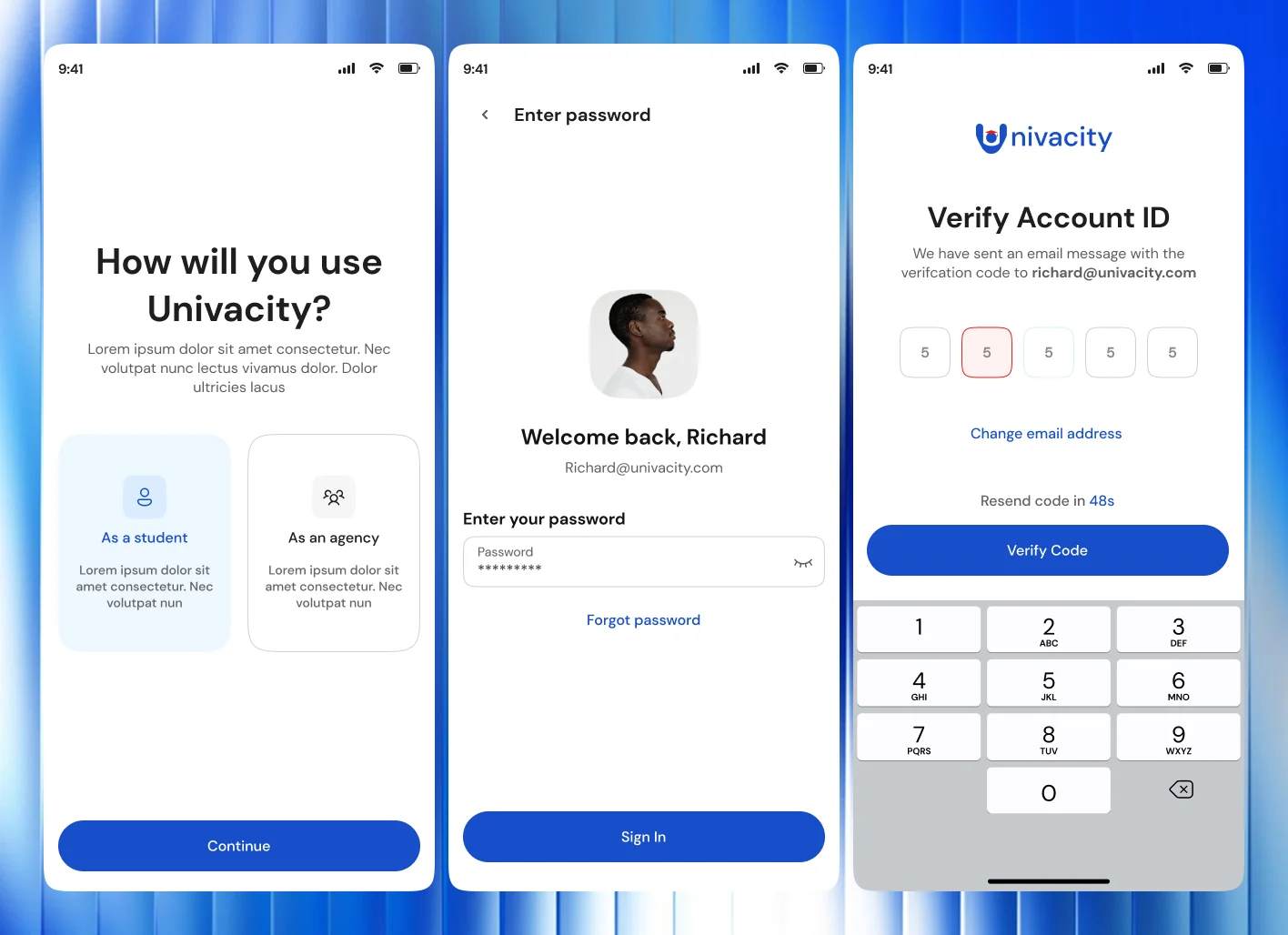
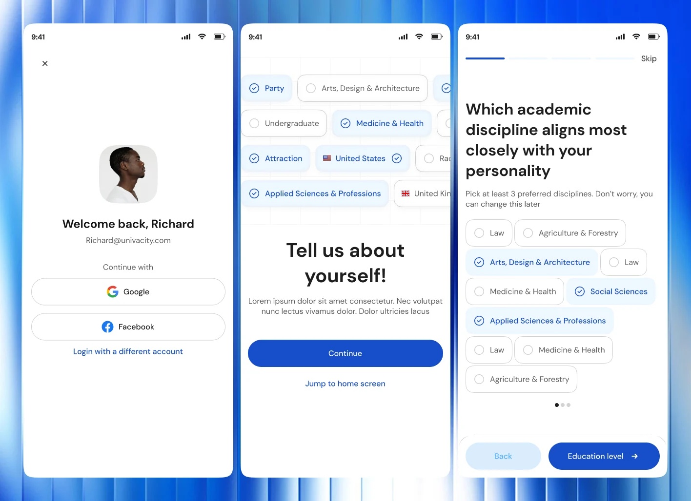
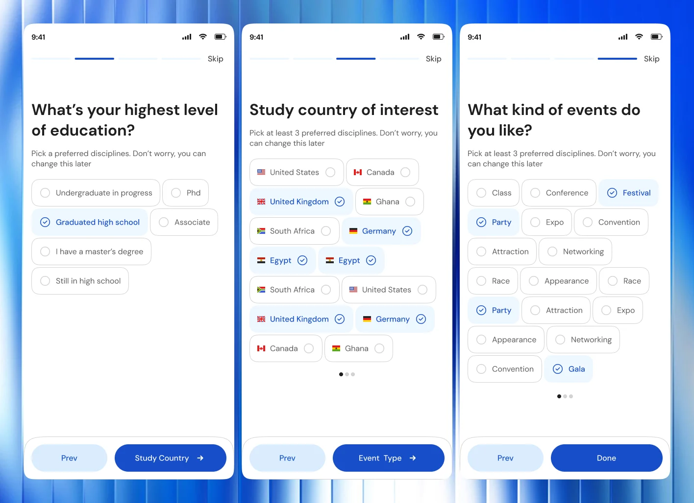
Onboarding asks for education level, preferred disciplines, study countries and event interests. It shows progress, and every step can be skipped.
Onboarding drop-offs fell 69%.
- 03
Services as modules
Services were fragmented, and the architecture couldn't take on new ones.
Scholarships, flights, hostels, visa and events as separate layers, each with clear entry and exit points, informed by studying how Vrbo, Airbnb and other hosting platforms structure bookings.
The hard part
Taking a flight turned out to be easier than designing how to book one
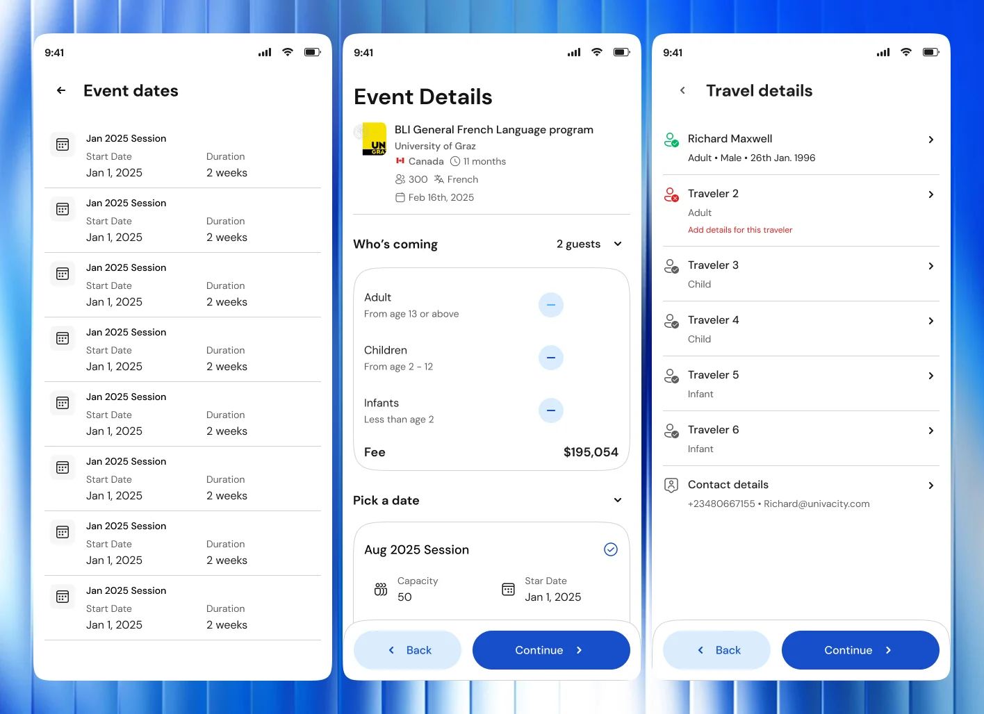
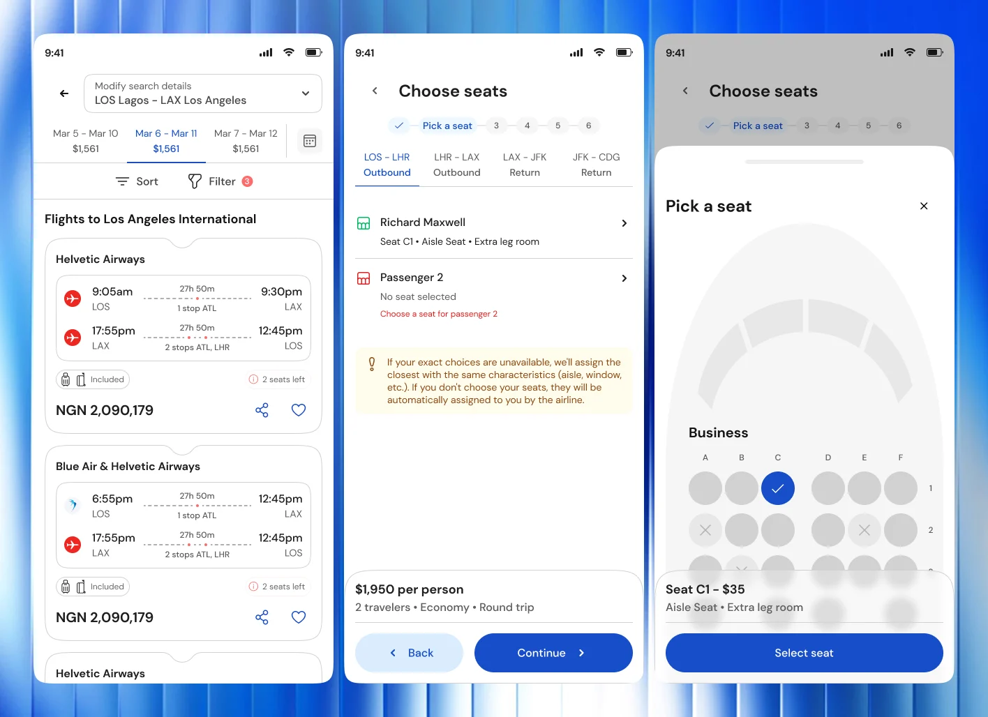
The flight service was the toughest part of the project. Getting from search results to seat selection took extensive research into flight booking systems before the journey came together.
Process
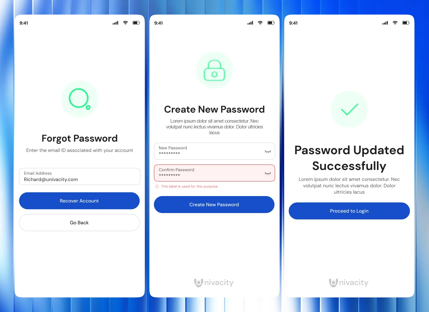
Over 60 wireframes, 3 tested prototypes
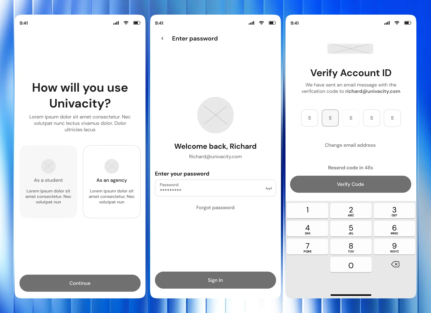
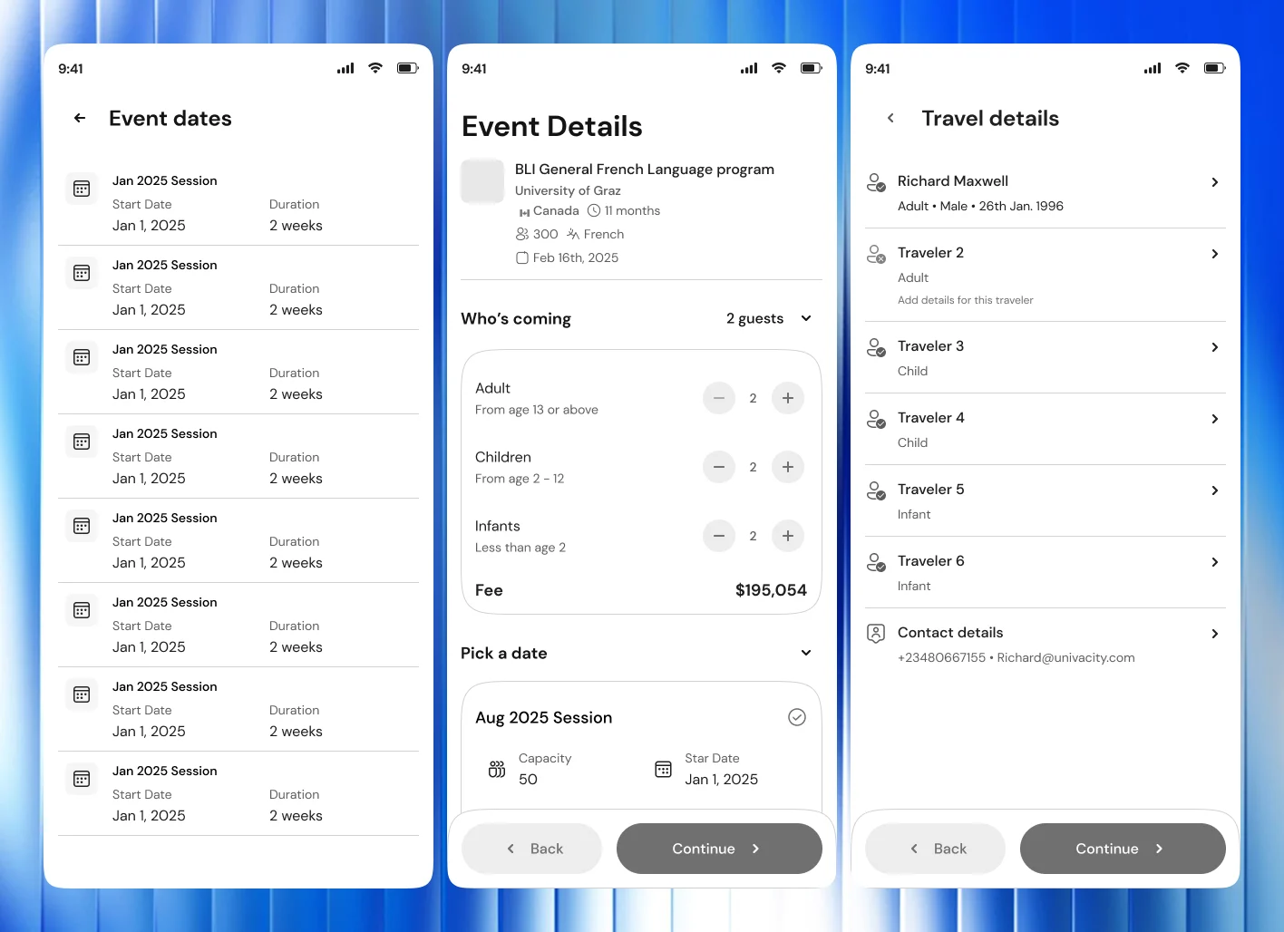
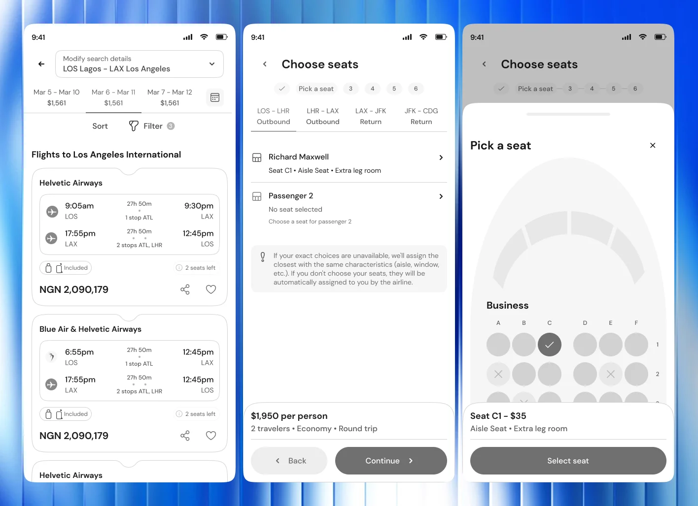
We drew over 60 wireframes across 5 user journeys. We built 3 major interactive prototypes and tested them in Maze and in person. Feedback from students and the internal team ran throughout.
Design system
A visual language we called "The brighter Africans"
Optimistic, and grounded in plain, modern UI: legible type, fast-loading components, minimal icons, and offline-first thinking for students on weak connections. The design system holds over 150 reusable components.
The outcome
A rebuilt app, from the first tap to the boarding gate
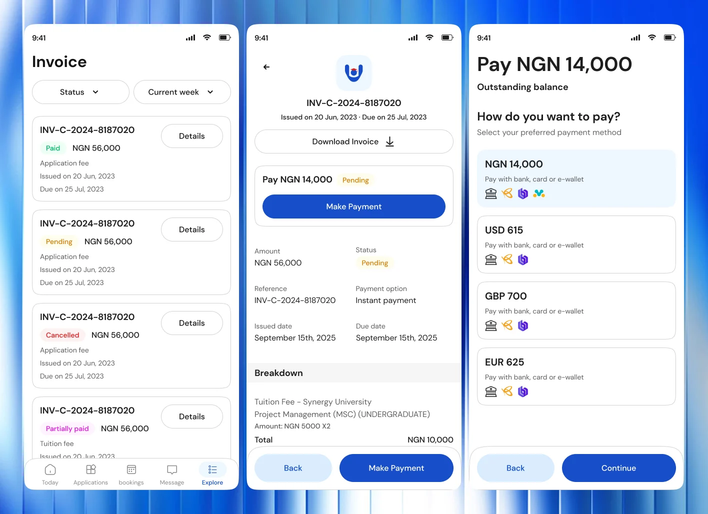
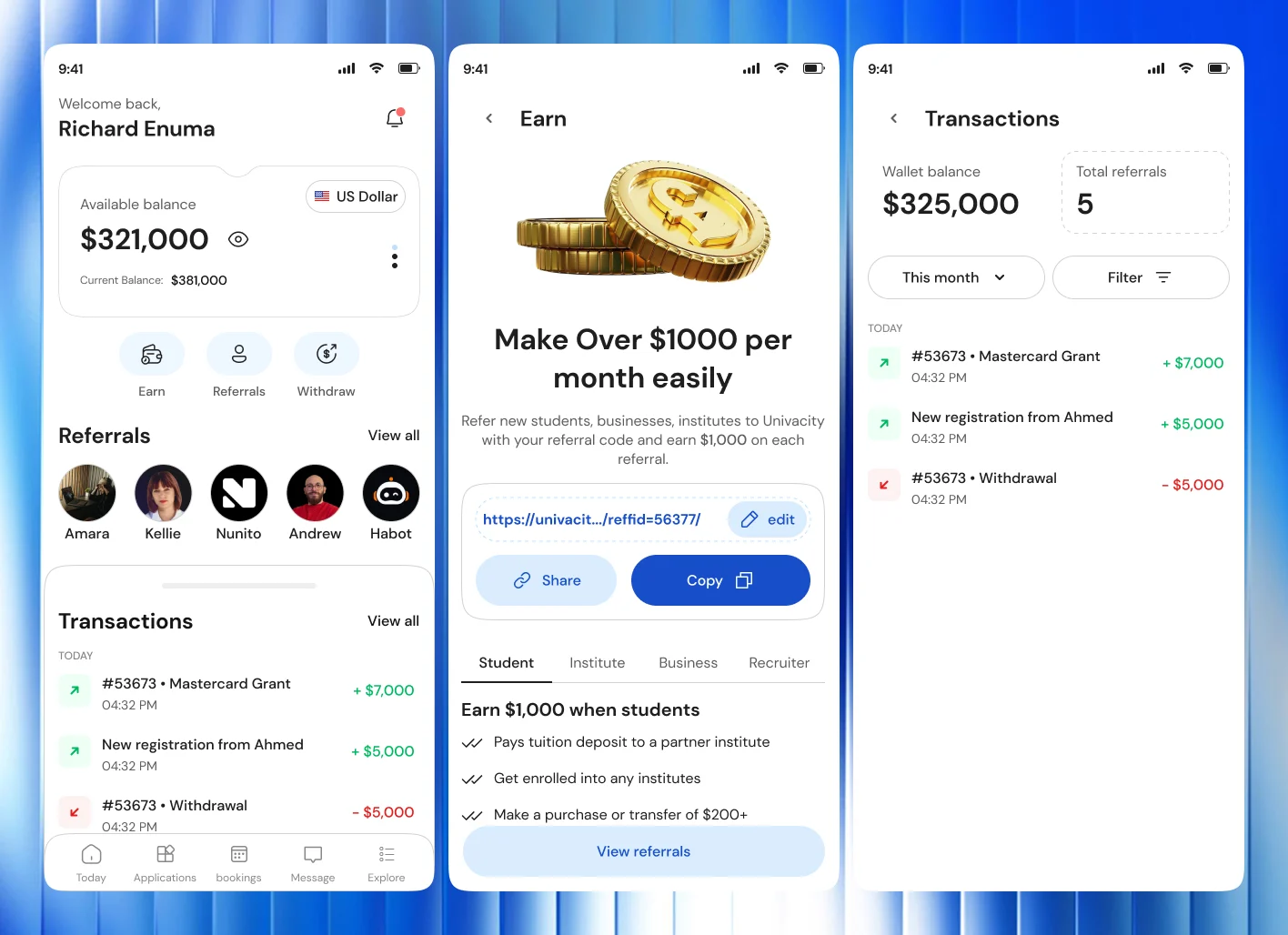
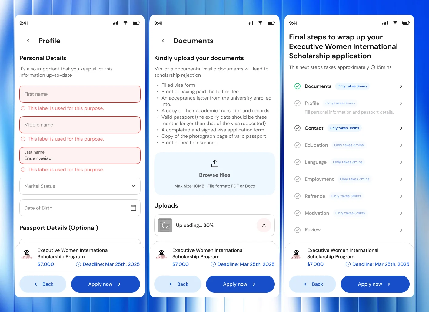
The services around the application
Results
Completed applications rose 42% within 6 weeks of the redesign
- 69% reduction in onboarding drop-offs.
- Application time down from 25 to 7 min on average.
- 30% increase in partnerships, with partners citing the improved student experience as a key factor.
The web platform came next. See Univacity Web.
Building something like Univacity? Let's talk about it.
Start a project
Tell us what you're building. A few lines is enough.
We'll read them, ask what we need to know and suggest a sensible first step.